React ecommerce storefront template
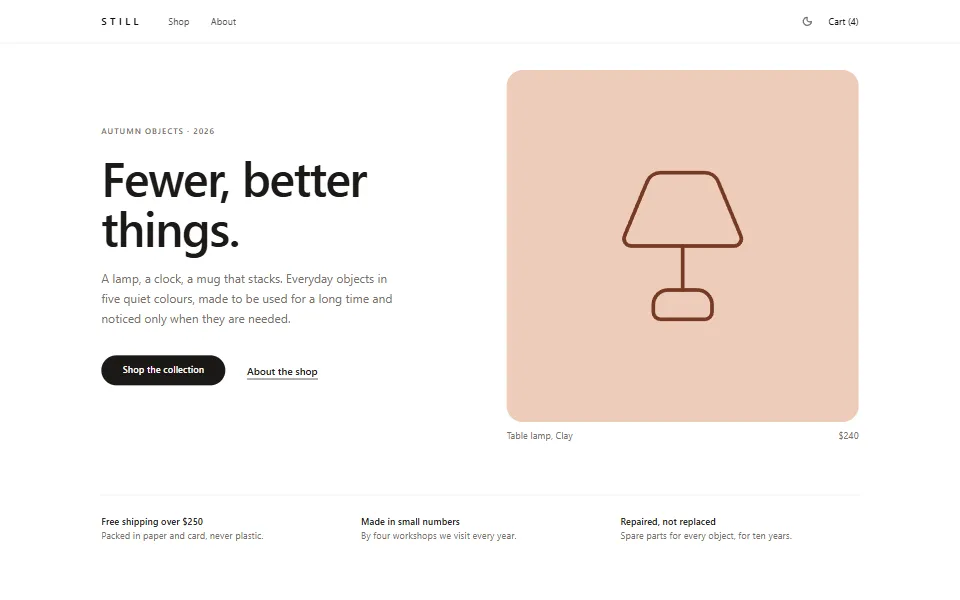
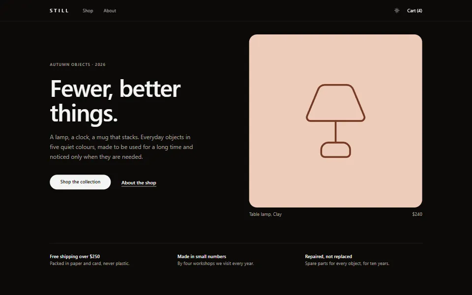
A store front page in React: a drawn hero, a product grid with filters and sorting, and a story band, in light and dark with no stylesheet.
Install
One command writes the page, its design and its 1 section into your project, as code you then own. It needs a
components.json, and the shadcn registry page has the one-time setup.Terminal
npx shadcn@latest add https://www.box-kite.dev/r/ecommerce-storefront.jsonSections
Each section is a block of its own, with its own page and its own install command.
Source
The page itself. Every style is a prop, so there is no stylesheet to copy with it, and each section it imports is on its own page above.
box-kite/store/storefront-page.tsx
JSX
'use client';
import Box from '@box-kite/react';
import Flex from '@box-kite/react/components/flex';
import Grid from '@box-kite/react/components/grid';
import { H1, H2, Link, P, Section, Span } from '@box-kite/react/components/semantics';
import ProductArt from './product-art';
import ProductGrid from './product-grid';
import { countOf, FREE_SHIPPING_FROM, formatPrice, productBySlug, sampleCart } from './store-data';
import { eyebrow, heading, muted, useStoreLinks } from './store-design';
import StoreShell from './store-shell';

const promises = [
  { title: `Free shipping over ${formatPrice(FREE_SHIPPING_FROM)}`, detail: 'Packed in paper and card, never plastic.' },
  { title: 'Made in small numbers', detail: 'By four workshops we visit every year.' },
  { title: 'Repaired, not replaced', detail: 'Spare parts for every object, for ten years.' },
];

const textLink = {
  fontSize: 15,
  fontWeight: 500,
  color: 'stone-900',
  textDecoration: 'underline',
  css: { textUnderlineOffset: '6px' },
  hover: { color: 'stone-500' },
  theme: { dark: { color: 'stone-100', hover: { color: 'stone-400' } } },
} as const;

/** The store's front page: the hero, three promises, the collection with its filters, and the shop's story. */
export default function StorefrontPage({ theme }: { theme?: string }) {
  const links = useStoreLinks();
  const lamp = productBySlug('table-lamp');

  return (
    <StoreShell cartCount={countOf(sampleCart)} theme={theme}>
      <Section props={{ 'aria-labelledby': 'hero-heading' }}>
        <Grid gridTemplateColumns={1} lg={{ gridTemplateColumns: 2 }} gap={10} xl={{ gap: 20 }} ai="center">
          <Box py={4} lg={{ py: 0 }}>
            <Span display="block" {...eyebrow} {...muted}>
              Autumn objects · 2026
            </Span>
            <H1
              id="hero-heading"
              mt={6}
              fontSize={48}
              lineHeight={52}
              md={{ fontSize: 72, lineHeight: 76 }}
              textWrap="balance"
              {...heading}
              letterSpacing={-2}
            >
              Fewer, better things.
            </H1>
            <P mt={6} maxWidth={110} fontSize={18} lineHeight={30} {...muted}>
              A lamp, a clock, a mug that stacks. Everyday objects in five quiet colours, made to be used for a long time and noticed only
              when they are needed.
            </P>
            <Flex gap={8} mt={10} ai="center" flexWrap="wrap">
              <Link component="button" props={{ href: '#collection' }} textDecoration="none" py={3.5} px={8}>
                Shop the collection
              </Link>
              <Link props={{ href: '#studio' }} {...textLink}>
                About the shop
              </Link>
            </Flex>
          </Box>

          <Box>
            <Link props={{ href: links.product(lamp.slug) }} display="block" aspectRatio="square" borderRadius={6}>
              <ProductArt shape={lamp.shape} finish="clay" label={`${lamp.name} in Clay`} stroke={0.5} radius={6} />
            </Link>
            <Flex jc="space-between" mt={3} fontSize={14} {...muted}>
              <Span>{lamp.name}, Clay</Span>
              <Span>{formatPrice(lamp.price)}</Span>
            </Flex>
          </Box>
        </Grid>
      </Section>

      <Grid
        gridTemplateColumns={1}
        md={{ gridTemplateColumns: 3 }}
        gap={8}
        mt={20}
        pt={8}
        bt={1}
        borderColor="stone-200"
        theme={{ dark: { borderColor: 'stone-800' } }}
      >
        {promises.map((promise) => (
          <Box key={promise.title}>
            <Span display="block" fontWeight={500}>
              {promise.title}
            </Span>
            <Span display="block" mt={1} fontSize={14} {...muted}>
              {promise.detail}
            </Span>
          </Box>
        ))}
      </Grid>

      <Box id="collection" mt={24} css={{ scrollMarginTop: '6rem' }}>
        <ProductGrid />
      </Box>

      <Studio />
    </StoreShell>
  );
}

function Studio() {
  return (
    <Section
      id="studio"
      props={{ 'aria-labelledby': 'studio-heading' }}
      mt={28}
      pt={16}
      bt={1}
      borderColor="stone-200"
      css={{ scrollMarginTop: '6rem' }}
      theme={{ dark: { borderColor: 'stone-800' } }}
    >
      <Grid gridTemplateColumns={1} md={{ gridTemplateColumns: 2 }} gap={12} xl={{ gap: 20 }} ai="center">
        <Box aspectRatio="square">
          <ProductArt
            shape="vase"
            finish="sand"
            also={['sage']}
            view="set"
            label="Two bud vases, one in Sand and one in Sage"
            stroke={0.5}
            radius={6}
          />
        </Box>
        <Box>
          <Span display="block" {...eyebrow} {...muted}>
            About
          </Span>
          <H2 id="studio-heading" mt={5} fontSize={36} lineHeight={42} textWrap="balance" {...heading} letterSpacing={-1}>
            Made slowly, in small numbers
          </H2>
          <P mt={6} fontSize={17} lineHeight={28} {...muted}>
            Every object starts as a drawing, goes through a dozen prototypes, and is made by one of four workshops we know by name. We
            would rather make one thing well than ten things quickly, so the collection changes once a year, not once a week.
          </P>
          <Box tag="blockquote" mt={10} mx={0} mb={0} ps={5} bs={2} borderColor="stone-900" theme={{ dark: { borderColor: 'stone-100' } }}>
            <P fontSize={18} lineHeight={28}>
              “The clock has hung in our kitchen for six years. I have never once had to think about it.”
            </P>
            <Span display="block" mt={3} fontSize={14} {...muted}>
              Ana, Chișinău
            </Span>
          </Box>
        </Box>
      </Grid>
    </Section>
  );
}
Design
What every page of this template shares: the built-in components restyled with
Box.createComponents(), applied to the subtree with <Box.Components>, so it stops at the edge of the store and the rest of your app keeps its own look.Store design
box-kite/store/store-design.tsx
JSX
'use client';
import Box from '@box-kite/react';
import { createContext, type ReactNode, useContext } from 'react';

/**
 * The store's design: the built-in components restyled for this one brand, in light and dark. It registers
 * nothing — `Box.createComponents()` returns a design, and `StoreSurface` applies it to its subtree only, so
 * the store can sit inside an app that looks like something else.
 */
export const storeDesign = Box.createComponents({
  // Square, solid and one colour: the only filled shape on a page of hairlines, so the action is never in doubt.
  button: {
    styles: {
      bgColor: 'stone-900',
      color: 'white',
      borderRadius: 999,
      px: 6,
      fontWeight: 500,
      transition: 'colors',
      hover: { bgColor: 'stone-700' },
      active: { bgColor: 'stone-800' },
      focus: { outlineColor: 'stone-400' },
      disabled: { bgColor: 'stone-200', color: 'stone-500', hover: { bgColor: 'stone-200' } },
      theme: {
        dark: {
          bgColor: 'stone-100',
          color: 'stone-950',
          hover: { bgColor: 'white' },
          active: { bgColor: 'stone-200' },
          focus: { outlineColor: 'stone-500' },
          disabled: { bgColor: 'stone-800', color: 'stone-500', hover: { bgColor: 'stone-800' } },
        },
      },
    },
    variants: {
      secondary: {
        bgColor: 'transparent',
        color: 'stone-900',
        b: 1,
        borderColor: 'stone-300',
        hover: { bgColor: 'transparent', borderColor: 'stone-900' },
        active: { bgColor: 'stone-100' },
        focus: { borderColor: 'stone-900', outlineColor: 'stone-300' },
        theme: {
          dark: {
            bgColor: 'transparent',
            color: 'stone-100',
            borderColor: 'stone-700',
            hover: { bgColor: 'transparent', borderColor: 'stone-200' },
            active: { bgColor: 'stone-900' },
            focus: { borderColor: 'stone-300', outlineColor: 'stone-600' },
          },
        },
      },
      ghost: {
        bgColor: 'transparent',
        color: 'stone-700',
        hover: { bgColor: 'stone-900/5' },
        active: { bgColor: 'stone-900/10' },
        disabled: { bgColor: 'transparent', color: 'stone-400' },
        theme: {
          dark: {
            bgColor: 'transparent',
            color: 'stone-300',
            hover: { bgColor: 'white/10' },
            active: { bgColor: 'white/15' },
            disabled: { bgColor: 'transparent', color: 'stone-600' },
          },
        },
      },
    },
  },
  textbox: {
    styles: {
      width: 'fit',
      borderRadius: 2.5,
      borderColor: 'stone-300',
      bgColor: 'white',
      color: 'stone-900',
      hover: { borderColor: 'stone-500' },
      focus: { borderColor: 'stone-900', outlineColor: 'stone-200' },
      ariaAttr: { invalid: { borderColor: 'red-700', focus: { outlineColor: 'red-200' } } },
      theme: {
        dark: {
          bgColor: 'stone-950',
          color: 'stone-100',
          borderColor: 'stone-700',
          hover: { borderColor: 'stone-500' },
          focus: { borderColor: 'stone-200', outlineColor: 'stone-800' },
          ariaAttr: { invalid: { borderColor: 'red-400', focus: { outlineColor: 'red-900' } } },
        },
      },
    },
  },
  checkbox: {
    styles: {
      borderRadius: 1,
      borderColor: 'stone-400',
      outlineColor: 'stone-300',
      hover: { borderColor: 'stone-900' },
      checked: { bgColor: 'stone-900', borderColor: 'stone-900' },
      theme: {
        dark: {
          borderColor: 'stone-500',
          outlineColor: 'stone-700',
          hover: { borderColor: 'stone-200' },
          checked: { bgColor: 'stone-600', borderColor: 'stone-200' },
        },
      },
    },
  },
  radioButton: {
    styles: {
      borderColor: 'stone-400',
      outlineColor: 'stone-300',
      hover: { borderColor: 'stone-900' },
      checked: { bgColor: 'stone-900', borderColor: 'stone-900' },
      theme: {
        dark: {
          borderColor: 'stone-500',
          outlineColor: 'stone-700',
          hover: { borderColor: 'stone-200' },
          checked: { bgColor: 'stone-600', borderColor: 'stone-200' },
        },
      },
    },
  },
  // The caption over a row of options rather than beside it: the row wraps, and the caption takes the first line whole.
  radioGroup: {
    variants: { horizontal: { flexWrap: 'wrap' } },
    children: {
      label: { styles: { width: 'fit', fontSize: 14, fontWeight: 500, color: 'stone-900', theme: { dark: { color: 'stone-100' } } } },
    },
  },
  dropdown: {
    styles: {
      width: 'fit',
      borderRadius: 2.5,
      borderColor: 'stone-300',
      bgColor: 'white',
      color: 'stone-900',
      hover: { borderColor: 'stone-500' },
      focus: { borderColor: 'stone-900', outlineColor: 'stone-200' },
      theme: {
        dark: {
          bgColor: 'stone-950',
          color: 'stone-100',
          borderColor: 'stone-700',
          hover: { borderColor: 'stone-500' },
          focus: { borderColor: 'stone-200', outlineColor: 'stone-800' },
        },
      },
    },
    children: {
      items: {
        styles: {
          borderRadius: 3,
          borderColor: 'stone-200',
          color: 'stone-900',
          theme: { dark: { bgColor: 'stone-950', borderColor: 'stone-800', color: 'stone-100' } },
        },
      },
      item: {
        styles: {
          borderRadius: 2,
          hover: { bgColor: 'stone-100' },
          focus: { bgColor: 'stone-100' },
          selected: { bgColor: 'stone-100', hover: { bgColor: 'stone-200' } },
          theme: {
            dark: {
              hover: { bgColor: 'stone-900' },
              focus: { bgColor: 'stone-900' },
              selected: { bgColor: 'stone-900', hover: { bgColor: 'stone-800' } },
            },
          },
        },
        variants: { highlighted: { outlineColor: 'stone-900', theme: { dark: { outlineColor: 'stone-200' } } } },
      },
    },
  },
  progress: {
    styles: { height: 0.5, borderRadius: 999, bgColor: 'stone-200', theme: { dark: { bgColor: 'stone-800' } } },
    children: {
      fill: { styles: { borderRadius: 999, bgColor: 'stone-900', theme: { dark: { bgColor: 'stone-100' } } } },
    },
  },
  accordion: {
    children: {
      item: { styles: { borderColor: 'stone-200', theme: { dark: { borderColor: 'stone-800' } } } },
      trigger: {
        styles: {
          py: 4,
          fontSize: 15,
          fontWeight: 500,
          color: 'stone-900',
          hover: { color: 'stone-500' },
          ariaAttr: { expanded: { color: 'stone-900' } },
          focusVisible: { outlineColor: 'stone-900' },
          theme: { dark: { color: 'stone-100', hover: { color: 'stone-400' }, ariaAttr: { expanded: { color: 'stone-100' } } } },
        },
      },
      panel: { styles: { fontSize: 15, lineHeight: 24, color: 'stone-600', theme: { dark: { color: 'stone-400' } } } },
    },
  },
  tabs: {
    children: {
      tab: { styles: { focusVisible: { outlineColor: 'stone-900' } } },
      panel: { styles: { focusVisible: { outlineColor: 'stone-900' } } },
    },
  },
});

/** Spread on a heading: a medium weight and tight tracking, in whatever sans the system already has. */
export const heading = { fontWeight: 500, letterSpacing: -0.5 } as const;

/** The small spaced capitals over a section, beside a badge or under a price. */
export const eyebrow = { fontSize: 12, fontWeight: 500, letterSpacing: 1.5, textTransform: 'uppercase' } as const;

/** A panel on the page: a hairline and soft corners, nothing else. */
export const card = { b: 1, borderRadius: 4, borderColor: 'stone-200', theme: { dark: { borderColor: 'stone-800' } } } as const;

/** Secondary text, in both themes. */
export const muted = { color: 'stone-500', theme: { dark: { color: 'stone-400' } } } as const;

/**
 * Where the pages and blocks link to. A provider rather than constants, so the same pages work under any
 * router: wrap them in `<StoreLinks.Provider value={…}>` with your own routes.
 */
export interface StoreRoutes {
  shop: string;
  product: (slug: string) => string;
  cart: string;
  checkout: string;
}

export const StoreLinks = createContext<StoreRoutes>({
  shop: '/',
  product: (slug) => `/products/${slug}`,
  cart: '/cart',
  checkout: '/checkout',
});

export const useStoreLinks = () => useContext(StoreLinks);

/** The design and the page colours, with no theme of its own: it follows whatever theme is around it. */
export function StoreSurface({ children }: { children: ReactNode }) {
  return (
    <Box.Components value={storeDesign}>
      <Box bgColor="white" color="stone-900" theme={{ dark: { bgColor: 'stone-950', color: 'stone-100' } }}>
        {children}
      </Box>
    </Box.Components>
  );
}

/**
 * A whole store page: its own light/dark switch, remembered under its own key, around `StoreSurface`.
 * Without `theme` it opens in the reader's saved choice, then their system's.
 */
export function StoreTheme({ theme, children }: { theme?: string; children: ReactNode }) {
  return (
    <Box.Theme theme={theme} storageKey="still-theme">
      <StoreSurface>
        <Box minHeight="fit-screen">{children}</Box>
      </StoreSurface>
    </Box.Theme>
  );
}
The command installs the rest of it beside that file —
store-data.ts, product-art.tsx, quantity-stepper.tsx, form-field.tsx, store-shell.tsx — and the repository has every file.