React checkout page template
A one-page React checkout: contact, shipping address, delivery options and a credit card form beside the order summary, light and dark.
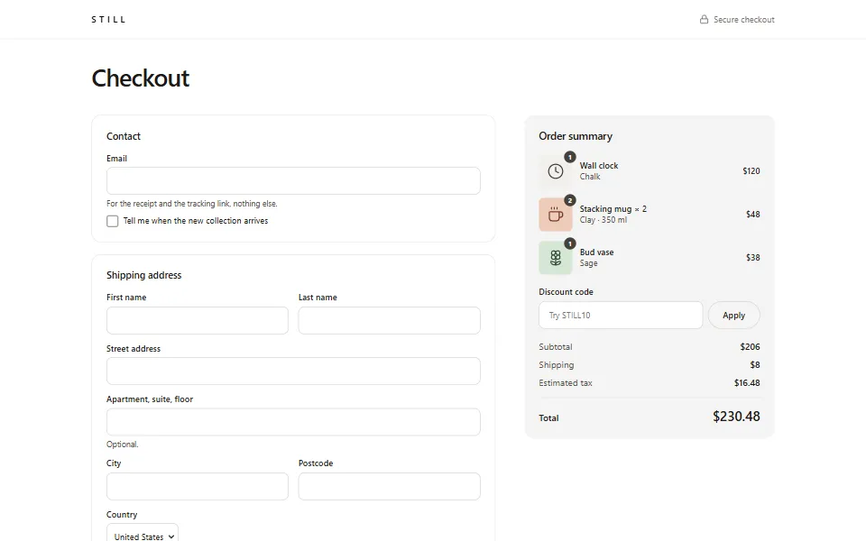
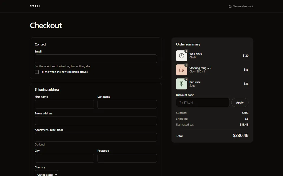
Install
One command writes the page, its design and its 4 sections into your project, as code you then own. It needs a
components.json, and the shadcn registry page has the one-time setup.Terminal
npx shadcn@latest add https://www.box-kite.dev/r/checkout-page.jsonSections
Each section is a block of its own, with its own page and its own install command.
Source
The page itself. Every style is a prop, so there is no stylesheet to copy with it, and each section it imports is on its own page above.
box-kite/store/checkout-page.tsx
JSX
'use client';
import Box from '@box-kite/react';
import Button from '@box-kite/react/components/button';
import Checkbox from '@box-kite/react/components/checkbox';
import Flex from '@box-kite/react/components/flex';
import Form from '@box-kite/react/components/form';
import Grid from '@box-kite/react/components/grid';
import { H1, P } from '@box-kite/react/components/semantics';
import Textbox from '@box-kite/react/components/textbox';
import { toast } from '@box-kite/react/components/toaster';
import { useState } from 'react';
import AddressForm from './address-form';
import CreditCardForm from './credit-card-form';
import FormField from './form-field';
import OrderSummary from './order-summary';
import ShippingMethod from './shipping-method';
import { FREE_SHIPPING_FROM, formatPrice, sampleCart, shippingMethods, subtotalOf, TAX_RATE } from './store-data';
import { card, heading } from './store-design';
import StoreShell from './store-shell';

const panel = { ...card, p: 6 } as const;

/**
 * The checkout: one form of contact, address, delivery and payment, beside the order it pays for. The
 * sections are separate blocks, each a `<fieldset>`, so the form reads every field by name on submit.
 */
export default function CheckoutPage({ theme }: { theme?: string }) {
  const lines = sampleCart;
  const [method, setMethod] = useState(shippingMethods[0].id);
  const [sameBilling, setSameBilling] = useState(true);
  const [discount, setDiscount] = useState(0);
  const subtotal = subtotalOf(lines);
  const freeStandard = subtotal >= FREE_SHIPPING_FROM;
  const chosen = shippingMethods.find((entry) => entry.id === method) ?? shippingMethods[0];
  const shipping = freeStandard && chosen.id === 'standard' ? 0 : chosen.price;
  const total = subtotal - discount + shipping + (subtotal - discount) * TAX_RATE;

  return (
    <StoreShell checkout theme={theme}>
      <H1 fontSize={40} lineHeight={46} mb={10} {...heading} letterSpacing={-1}>
        Checkout
      </H1>

      <Grid gridTemplateColumns={1} lg={{ css: { gridTemplateColumns: 'minmax(0, 1fr) 26rem' } }} gap={12} ai="start">
        <Form<Record<string, string>>
          display="flex"
          d="column"
          gap={5}
          onSubmit={(values) =>
            toast.success('Order placed', { description: `A confirmation is on its way to ${values.email || 'your inbox'}.` })
          }
        >
          <Box {...panel}>
            <Box tag="fieldset" b={0} p={0} m={0} minWidth={0}>
              <Box tag="legend" fontSize={16} fontWeight={500} mb={5}>
                Contact
              </Box>
              <Flex d="column" gap={3}>
                <FormField label="Email" hint="For the receipt and the tracking link, nothing else.">
                  {(control) => <Textbox name="email" type="email" props={{ ...control, autoComplete: 'email' }} required />}
                </FormField>
                <Checkbox name="newsletter" label="Tell me when the new collection arrives" />
              </Flex>
            </Box>
          </Box>

          <Box {...panel}>
            <AddressForm />
          </Box>

          <Box {...panel}>
            <ShippingMethod value={method} onValueChange={setMethod} freeStandard={freeStandard} />
          </Box>

          <Box {...panel}>
            <CreditCardForm />
            <Box mt={5}>
              <Checkbox
                name="sameBilling"
                label="Billing address is the same as shipping"
                checked={sameBilling}
                onChange={(event) => setSameBilling(event.target.checked)}
              />
            </Box>
          </Box>

          {!sameBilling && (
            <Box {...panel}>
              <AddressForm legend="Billing address" prefix="billing" />
            </Box>
          )}

          <Box>
            <Button type="submit" width="fit" py={4} fontSize={17}>
              Pay {formatPrice(total)}
            </Button>
            <P mt={3} fontSize={13} textAlign="center" color="stone-600" theme={{ dark: { color: 'stone-400' } }}>
              A demo: nothing is charged and nothing is sent anywhere.
            </P>
          </Box>
        </Form>

        <Box lg={{ position: 'sticky', top: 24 }}>
          <OrderSummary lines={lines} shipping={shipping} showLines onDiscountChange={setDiscount} />
        </Box>
      </Grid>
    </StoreShell>
  );
}
Design
What every page of this template shares: the built-in components restyled with
Box.createComponents(), applied to the subtree with <Box.Components>, so it stops at the edge of the store and the rest of your app keeps its own look.Store design
box-kite/store/store-design.tsx
JSX
'use client';
import Box from '@box-kite/react';
import { createContext, type ReactNode, useContext } from 'react';

/**
 * The store's design: the built-in components restyled for this one brand, in light and dark. It registers
 * nothing — `Box.createComponents()` returns a design, and `StoreSurface` applies it to its subtree only, so
 * the store can sit inside an app that looks like something else.
 */
export const storeDesign = Box.createComponents({
  // Square, solid and one colour: the only filled shape on a page of hairlines, so the action is never in doubt.
  button: {
    styles: {
      bgColor: 'stone-900',
      color: 'white',
      borderRadius: 999,
      px: 6,
      fontWeight: 500,
      transition: 'colors',
      hover: { bgColor: 'stone-700' },
      active: { bgColor: 'stone-800' },
      focus: { outlineColor: 'stone-400' },
      disabled: { bgColor: 'stone-200', color: 'stone-500', hover: { bgColor: 'stone-200' } },
      theme: {
        dark: {
          bgColor: 'stone-100',
          color: 'stone-950',
          hover: { bgColor: 'white' },
          active: { bgColor: 'stone-200' },
          focus: { outlineColor: 'stone-500' },
          disabled: { bgColor: 'stone-800', color: 'stone-500', hover: { bgColor: 'stone-800' } },
        },
      },
    },
    variants: {
      secondary: {
        bgColor: 'transparent',
        color: 'stone-900',
        b: 1,
        borderColor: 'stone-300',
        hover: { bgColor: 'transparent', borderColor: 'stone-900' },
        active: { bgColor: 'stone-100' },
        focus: { borderColor: 'stone-900', outlineColor: 'stone-300' },
        theme: {
          dark: {
            bgColor: 'transparent',
            color: 'stone-100',
            borderColor: 'stone-700',
            hover: { bgColor: 'transparent', borderColor: 'stone-200' },
            active: { bgColor: 'stone-900' },
            focus: { borderColor: 'stone-300', outlineColor: 'stone-600' },
          },
        },
      },
      ghost: {
        bgColor: 'transparent',
        color: 'stone-700',
        hover: { bgColor: 'stone-900/5' },
        active: { bgColor: 'stone-900/10' },
        disabled: { bgColor: 'transparent', color: 'stone-400' },
        theme: {
          dark: {
            bgColor: 'transparent',
            color: 'stone-300',
            hover: { bgColor: 'white/10' },
            active: { bgColor: 'white/15' },
            disabled: { bgColor: 'transparent', color: 'stone-600' },
          },
        },
      },
    },
  },
  textbox: {
    styles: {
      width: 'fit',
      borderRadius: 2.5,
      borderColor: 'stone-300',
      bgColor: 'white',
      color: 'stone-900',
      hover: { borderColor: 'stone-500' },
      focus: { borderColor: 'stone-900', outlineColor: 'stone-200' },
      ariaAttr: { invalid: { borderColor: 'red-700', focus: { outlineColor: 'red-200' } } },
      theme: {
        dark: {
          bgColor: 'stone-950',
          color: 'stone-100',
          borderColor: 'stone-700',
          hover: { borderColor: 'stone-500' },
          focus: { borderColor: 'stone-200', outlineColor: 'stone-800' },
          ariaAttr: { invalid: { borderColor: 'red-400', focus: { outlineColor: 'red-900' } } },
        },
      },
    },
  },
  checkbox: {
    styles: {
      borderRadius: 1,
      borderColor: 'stone-400',
      outlineColor: 'stone-300',
      hover: { borderColor: 'stone-900' },
      checked: { bgColor: 'stone-900', borderColor: 'stone-900' },
      theme: {
        dark: {
          borderColor: 'stone-500',
          outlineColor: 'stone-700',
          hover: { borderColor: 'stone-200' },
          checked: { bgColor: 'stone-600', borderColor: 'stone-200' },
        },
      },
    },
  },
  radioButton: {
    styles: {
      borderColor: 'stone-400',
      outlineColor: 'stone-300',
      hover: { borderColor: 'stone-900' },
      checked: { bgColor: 'stone-900', borderColor: 'stone-900' },
      theme: {
        dark: {
          borderColor: 'stone-500',
          outlineColor: 'stone-700',
          hover: { borderColor: 'stone-200' },
          checked: { bgColor: 'stone-600', borderColor: 'stone-200' },
        },
      },
    },
  },
  // The caption over a row of options rather than beside it: the row wraps, and the caption takes the first line whole.
  radioGroup: {
    variants: { horizontal: { flexWrap: 'wrap' } },
    children: {
      label: { styles: { width: 'fit', fontSize: 14, fontWeight: 500, color: 'stone-900', theme: { dark: { color: 'stone-100' } } } },
    },
  },
  dropdown: {
    styles: {
      width: 'fit',
      borderRadius: 2.5,
      borderColor: 'stone-300',
      bgColor: 'white',
      color: 'stone-900',
      hover: { borderColor: 'stone-500' },
      focus: { borderColor: 'stone-900', outlineColor: 'stone-200' },
      theme: {
        dark: {
          bgColor: 'stone-950',
          color: 'stone-100',
          borderColor: 'stone-700',
          hover: { borderColor: 'stone-500' },
          focus: { borderColor: 'stone-200', outlineColor: 'stone-800' },
        },
      },
    },
    children: {
      items: {
        styles: {
          borderRadius: 3,
          borderColor: 'stone-200',
          color: 'stone-900',
          theme: { dark: { bgColor: 'stone-950', borderColor: 'stone-800', color: 'stone-100' } },
        },
      },
      item: {
        styles: {
          borderRadius: 2,
          hover: { bgColor: 'stone-100' },
          focus: { bgColor: 'stone-100' },
          selected: { bgColor: 'stone-100', hover: { bgColor: 'stone-200' } },
          theme: {
            dark: {
              hover: { bgColor: 'stone-900' },
              focus: { bgColor: 'stone-900' },
              selected: { bgColor: 'stone-900', hover: { bgColor: 'stone-800' } },
            },
          },
        },
        variants: { highlighted: { outlineColor: 'stone-900', theme: { dark: { outlineColor: 'stone-200' } } } },
      },
    },
  },
  progress: {
    styles: { height: 0.5, borderRadius: 999, bgColor: 'stone-200', theme: { dark: { bgColor: 'stone-800' } } },
    children: {
      fill: { styles: { borderRadius: 999, bgColor: 'stone-900', theme: { dark: { bgColor: 'stone-100' } } } },
    },
  },
  accordion: {
    children: {
      item: { styles: { borderColor: 'stone-200', theme: { dark: { borderColor: 'stone-800' } } } },
      trigger: {
        styles: {
          py: 4,
          fontSize: 15,
          fontWeight: 500,
          color: 'stone-900',
          hover: { color: 'stone-500' },
          ariaAttr: { expanded: { color: 'stone-900' } },
          focusVisible: { outlineColor: 'stone-900' },
          theme: { dark: { color: 'stone-100', hover: { color: 'stone-400' }, ariaAttr: { expanded: { color: 'stone-100' } } } },
        },
      },
      panel: { styles: { fontSize: 15, lineHeight: 24, color: 'stone-600', theme: { dark: { color: 'stone-400' } } } },
    },
  },
  tabs: {
    children: {
      tab: { styles: { focusVisible: { outlineColor: 'stone-900' } } },
      panel: { styles: { focusVisible: { outlineColor: 'stone-900' } } },
    },
  },
});

/** Spread on a heading: a medium weight and tight tracking, in whatever sans the system already has. */
export const heading = { fontWeight: 500, letterSpacing: -0.5 } as const;

/** The small spaced capitals over a section, beside a badge or under a price. */
export const eyebrow = { fontSize: 12, fontWeight: 500, letterSpacing: 1.5, textTransform: 'uppercase' } as const;

/** A panel on the page: a hairline and soft corners, nothing else. */
export const card = { b: 1, borderRadius: 4, borderColor: 'stone-200', theme: { dark: { borderColor: 'stone-800' } } } as const;

/** Secondary text, in both themes. */
export const muted = { color: 'stone-500', theme: { dark: { color: 'stone-400' } } } as const;

/**
 * Where the pages and blocks link to. A provider rather than constants, so the same pages work under any
 * router: wrap them in `<StoreLinks.Provider value={…}>` with your own routes.
 */
export interface StoreRoutes {
  shop: string;
  product: (slug: string) => string;
  cart: string;
  checkout: string;
}

export const StoreLinks = createContext<StoreRoutes>({
  shop: '/',
  product: (slug) => `/products/${slug}`,
  cart: '/cart',
  checkout: '/checkout',
});

export const useStoreLinks = () => useContext(StoreLinks);

/** The design and the page colours, with no theme of its own: it follows whatever theme is around it. */
export function StoreSurface({ children }: { children: ReactNode }) {
  return (
    <Box.Components value={storeDesign}>
      <Box bgColor="white" color="stone-900" theme={{ dark: { bgColor: 'stone-950', color: 'stone-100' } }}>
        {children}
      </Box>
    </Box.Components>
  );
}

/**
 * A whole store page: its own light/dark switch, remembered under its own key, around `StoreSurface`.
 * Without `theme` it opens in the reader's saved choice, then their system's.
 */
export function StoreTheme({ theme, children }: { theme?: string; children: ReactNode }) {
  return (
    <Box.Theme theme={theme} storageKey="still-theme">
      <StoreSurface>
        <Box minHeight="fit-screen">{children}</Box>
      </StoreSurface>
    </Box.Theme>
  );
}
The command installs the rest of it beside that file —
store-data.ts, product-art.tsx, quantity-stepper.tsx, form-field.tsx, store-shell.tsx — and the repository has every file.