Box Kite
Box Kite
v2.2.4
DocsStart with AIBlocksBlog
Built for AI
MCP
Getting Started
Introduction
Start with AI
Installation
Playground
Showcase
Blocks
shadcn registry
Releases
Theme Setup
Server Components
Working with AI
Generative UI
Interop
Agent
Core
Box
Box functions
SVG
Icon
Charts
Animation
Motion Showcase
State Variants
Pseudo-Elements
Container Queries
Anchor Positioning
Gradients & Effects
Right to Left
Escape Hatch
Components
Button
Textbox
Textarea
Checkbox
Radio Button
Switch
Tooltip
Popover
Dialog
Menu
Tabs
Accordion
Slider
Progress
Toaster
Overlay
Combobox
Dropdown
Dashboard
Data Grid
Benchmark
Layout
Flex
Grid
Extensions
Style Grouping
Resources
Colors
Theme
DocsStart with AIBlocksBlog
Star

React UI blocks

Finished sections to copy into your own app, each one drawn in light and dark, with the whole source on its page.
A block is a composition of the components, not a component: the part of a page that is always half yours. Each one installs with npx shadcn add as files you then edit — the shadcn registry page has the setup.
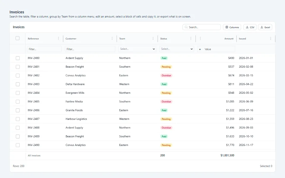
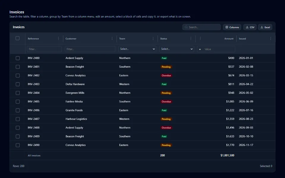
React invoice data grid, in the light themeReact invoice data grid, in the dark theme
React invoice data grid

A virtualized invoice table with search, column filters, grouping, totals, an editable amount, copy and paste, and CSV/XLSX export.

See it, and the code
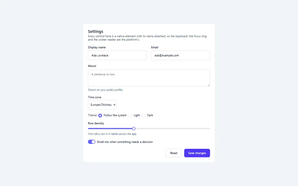
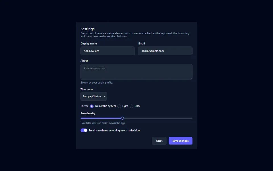
React settings form, in the light themeReact settings form, in the dark theme
React settings form

A settings panel of real form controls: text fields, a searchable select, a radio group, a slider and a switch, read on submit with no state.

See it, and the code
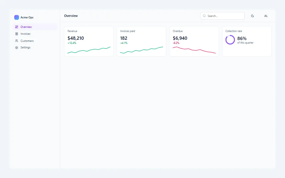
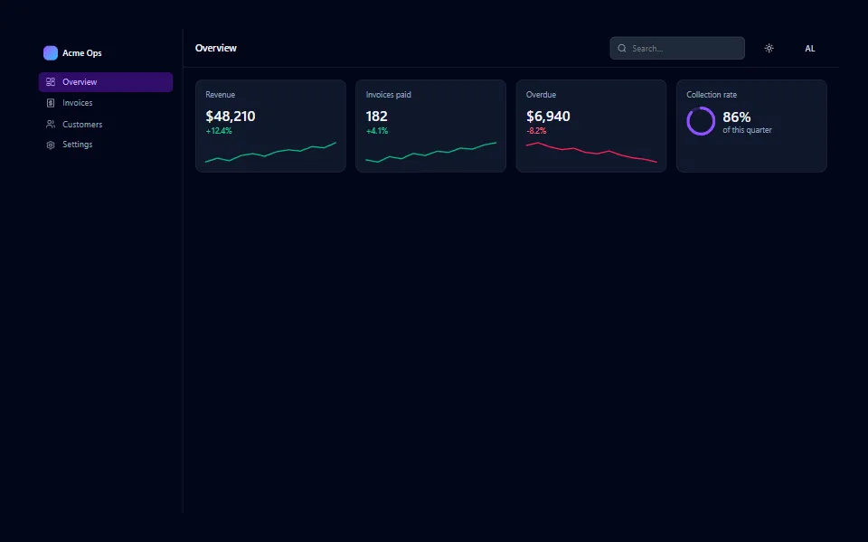
React admin dashboard layout, in the light themeReact admin dashboard layout, in the dark theme
React admin dashboard layout

The frame an admin app hangs off: a sidebar, a header with search, a theme toggle and an account menu, and a row of stat tiles.

See it, and the code
For an agent reading this:
This page as markdown
·
llms.txt
·
Every prop, measured
Edit this page